Texten bygger på en tidigare engelsk version, nu bearbetad och återgiven på svenska.For the original English text, see [Understanding Synesthesia:]
Syfte och metod
Syftet med studien är att undersöka mina egna perceptuella upplevelser i relation till fenomenet synestesi. Studien fokuserar på hur färg, form, ljud och begrepp samverkar i min vardagliga perception. Genom självobservation och jämförelse med befintlig forskning identifieras flera synestetiska uttryck, framför allt grafemfärgssynestesi, dagfärgssynestesi och tid-rumssynestesi.
Min färgstarka förmåga
Vardagen är inte bara svart eller vit. Den är en färgpalett som fångar intryck och sinnesstämningar i regnbågens alla nyanser. Om jag frågar vad du heter och du svarar “Erik”, då är du grön. Jag heter Björn, och är blå. B som i blå. Om du heter Anna, är du röd. Patrik är brun. Sofie är vit. Johanna är vinröd osv.
Namn och färger blandas samman. Det visar de fascinerande kopplingar jag skapar mellan namn och färg. Det är uppenbart – det är synestesi!
Om mitt namn (Björn) är blått och låter som en isig vind – vilka färger sätter du på ord?
Har siffror färger?
Är du som jag?
Vad är synestesi?
Synestesi är ett neurologiskt fenomen där sinnena är sammankopplade. Den vanligaste formen, grafemfärgsynestesi, innebär automatiska och konsekventa kopplingar mellan bokstäver eller siffror och specifika färger. Dessa samband är ofta envägs och utvecklas tidigt i barndomen.
Synestesi kan ta sig många uttryck. Den kan exempelvis koppla tidsenheter till färger eller förvandla musik till visuella upplevelser. Man har identifierat omkring 70 olika typer.
Forskning
Enligt forskning vid Karolinska Institutet definieras synestesi som en unik förmåga där sinnesintryck eller tankar kopplas samman på ovanliga sätt. Bokstäver kan till exempel vara förknippade med färger, eller ljud kan framkalla former.
Cirka 4% av befolkningen har någon form av synestesi. Fenomenet varierar mellan individer och är delvis ärftligt. Forskare menar att synestesi ofta triggas av begrepp snarare än direkta sinnesintryck.
Det kan hjälpa hjärnan att göra abstrakta idéer mer konkreta. Synesteter uppvisar ibland förbättrad minnesförmåga och en tydlig kreativ ådra – något som förklarar kopplingen till konstnärliga yrken.
Synestesi och autism?
Det finns teorier om samband mellan synestesi och autism. Det finns också teorier om samband mellan synestesi och tvångssyndrom. Detta beror på liknande mönster i hjärnans kopplingar och detaljfokus. Pågående forskning studerar dessa samband genom tvillingstudier och hjärnavbildning.
Synestesi är inte en funktionsnedsättning. Den upplevs ofta som något positivt, eftersom den berikar individens erfarenheter och visar hur unikt människor kan uppfatta världen.
Hur – på vilket sätt
Hur låter färgen röd? Endast någon med synestesi kan svara på det. En person hör en trumpet och ser trianglar, en annan tänker på basket och känner smaken av våfflor. En tredje uppfattar siffran nio som en särskild nyans av rosa.
Synestesi betyder ”samtidig perception”. Forskning visar att det ofta är själva begreppet eller idén om något som utlöser den synestetiska upplevelsen.
De vanligaste formerna är:
Auditiv-taktil synestesi: Ljud framkallar känselförnimmelser som tryck, värme eller smärta.
Dagfärgssynestesi: Veckodagar upplevs i specifika färger.
Grafemfärgssynestesi: Bokstäver, siffror eller symboler har bestämda färger.
Hörsel-rörelsesynestesi: Rörelser upplevs med tillhörande ljud, t.ex. ett ”svisch”.
Spegelberöringssynestesi: När man ser någon beröras eller skadas och känner det fysiskt själv.
Ljud-färgssynestesi: Ljud eller musik väcker färgupplevelser.
Tid-rumssynestesi: Tidssekvenser (t.ex. kalendern) visualiseras som mönster eller former.
Spatial sekvenssynestesi (SSS): Siffror, datum eller sekvenser upplevs som placerade i rummet i bestämda mönster
Min färgstarka vardag
Jag lärde mig ordet synestesi för inte så länge sedan. Tidigare var jag omedveten om att fenomenet hade ett namn. När jag fick det beskrivet för mig kände jag att hela mitt liv rymdes i det ordet.
I åratal har jag sett ord, siffror, datum, tider och bokstäver i färger. Det började när jag var barn.
Mina former av synestesi passar in på alternativen ovan, 2, 3, 7 och 8. Jag har både färg och en form på hela året och dess månader.
Så här ser året ut i mitt huvud. Varje månad har sin egen färg. Dagarna kring jul och fram till nyår upptar den övre raden i min inre bild. Tydliga tecken på (7) Tid-rumssynestesi.
Först kommer julhelgen. Därefter kommer mellandagarna. Till sist är det nyåret. Den raden täcker en vecka, medan den undre representerar större delen av året.
Nu är det november. Hela månaden har jag föreställt mig att jag befinner mig på den branta högra kortsidan av rektangeln. I uppåtstigande rörelse. Inte förrän dagarna innan jul, svänger det in på den övre långsidan av rektangeln. Där befinner jag mig ända fram till det nya årets första dag.
Ordens kulör
Veckans alla dagar: Måndag, Tisdag, Onsdag, Torsdag, Fredag, Lördag, Söndag
På liknande sätt ser jag veckodagar, namn, bokstäver och siffror i färg. Orden får sina nyanser genom sina inledande bokstäver och genom datum som knyts till dem. Det omfattar, (2) dagfärgssynestesi, (3) grafemfärgssynestesi och (8) Spatial sekvenssynestesi (SSS). Som tidigare nämnt, har olika namn olika färger, baserat på första bokstaven i namnet.
Exempel: Om du säger att vi har möte kl. 16:00, är det mörkblå tid. Om det är flyttat till kl. 18:00, är det vinrött. Det kan skapa konflikt i mitt huvud, eftersom kl. 17:00 har en ljusare röd färg och kan skapa missförstånd. (7) Tid-rumssynestesi.
Den vanligaste formen, (3) grafemfärgssynestesi innefattar färger på siffror och bokstäver. Som jag tidigare nämnt, har jag olika färger för olika namn, med koppling till första bokstaven. Siffror är inget undantag. Även där fylls de av färger i mitt sinne.
Exempel: Tre datum stack ut i december 2024 och två kommande datum i år 2025.
Den 3:e var grön 🟩.
Den 4:e var svart ⬛️ – en djup kontrast som väcker känslor av mystik och tyngd. Då hade ett jag läkarbesök.
Den 5:e var gul 🟨 – ljus och varm, fylld av optimism. Då var det julbord med kollegorna.
I år är julbordet den 2:a och det datumet är rött 🟥.
Den 4:e i år är det APT (oönskat), men fortfarande svart ⬛️.
Färger ger verkligen energi och skickar signaler till hjärnan. Dessa signaler hjälper mig att minnas. De påverkar också mina känslor och min kreativitet. Mitt poetisk skapande och mitt unika sätt att minnas saker och händelser, samt mitt starka bildminne.
Slutsats
Genom mina egna upplevelser har jag insett att jag har synestesi. Jag kopplar färg, form, ord, tid och siffror på ett stabilt sätt. Detta har funnits sedan barndomen och stämmer överens med forskning om synestesi. Det förstärker min upplevelse av världen och omvandlar abstrakta begrepp till konkreta erfarenheter, vilket fördjupar kopplingen mellan tanke och känsla. Mina upplevelser överensstämmer särskilt med grafemfärgssynestesi och dagfärgssynestesi, och synestesi är en del av min identitet.
Art draws inspiration from the past while simultaneously striving for innovation. Every artist carries the weight of history within them, yet they yearn to discover their unique style. This delicate balance between heritage and change is where creation truly blossoms. Tradition transforms into material that emerges as something distinct and vibrant.
Something I’ve always wondered about is the phrase: “All art is born from art.” It can be interpreted in different ways. However, for me, it underscores a fundamental truth. This truth is about the cyclical nature of creativity. Just as many great artworks throughout history are built upon earlier ideas, a dialogue continues between different eras. Artworks exhibit various styles, which is similar to the other phrase: “There’s nothing new under the sun.”
Today’s artists draw inspiration from the past by repurposing and reimagining these influences. This creative process allows them to craft something novel and pertinent. This exemplifies the ongoing evolution of art and ideas. Ultimately, it underscores that art is a collective endeavor, with each piece contributing to a larger, ever-developing narrative.
I’m curious about the multifaceted nature of art. There are so many layers of meaning and significance that require in-depth exploration. Where can I find answers to my questions? I’m particularly interested in the origins of contemporary artworks. It’s fascinating to consider how the creative expressions of earlier generations have shaped our current artistic landscape. How have new art styles emerged from the old, driven by a quest for identity and understanding? Who holds the answers to these questions that perplex me? I yearn to uncover the historical insights that can illuminate our understanding of art and its evolution.
On a deeper level, I find myself pondering the intricate distinction between forgery and imitation. This complex question explores the realms of art and ethics. It raises profound questions about the acceptable boundaries of inspiration. It also considers the fine line between resemblance and caricature. The intention behind the creation becomes a pivotal factor in these cases. While a resemblance seeks to pay homage, a caricature often aims to mock or criticize. These subtle nuances can be challenging to define. Yet, they are crucial in shaping our perception. They also impact the valuation of both artistic works and cultural expressions.
The resemblance of a work to earlier works often leads to claims of similarity and inspiration. This phenomenon is not limited to visual arts. It also applies to music and lyrics. Many expressions and themes frequently recur in different versions. For instance, a poem I write may resemble someone else’s without my knowledge. This can sometimes evoke a sense of wonder. Is it merely a coincidence that influences our creations? Or are there common frameworks that draw us towards similar images and emotions? Only we, as creators, can truly know. We navigate a world filled with influences and ideas, constantly seeking our unique expression. Simultaneously, we are aware of how we shape and are shaped by the works that have come before us.
It’s crucial to comprehend an artist’s intent behind their work. This applies irrespective of whether it’s groundbreaking, revolutionary, or a reproduction of earlier creations. Each artwork carries a profound significance and context. Every interpretation is unique and can evoke diverse emotions and thoughts within us.
I, along with other observers, cannot provide precise answers. Our interpretations are shaped by our unique perspectives, experiences, and emotions. This inherent subjectivity makes art a dynamic and personal experience for everyone who engages with it. The artwork becomes a dialogue between the artist and the observer, with both parties contributing to its meaning and significance.
In today’s art world, it’s an intriguing question to ponder. Does the artist possess knowledge of art history? Or are they simply forging their own unique path? Many artists draw inspiration from the past. However, I believe that most have a solid foundation in the traditional art forms. By studying earlier works, they gain insights and techniques that shape their own creations. These references add depth and richness to the art being produced today. They also ensure that it resonates with audiences on a deeper level.
It’s also crucial to not merely replicate the past. Instead, artists must discover a distinctive and original voice in their creations. The artist seeks to express themselves, while simultaneously allowing the viewer to interpret the work freely. This fosters a dialogue between the artwork and the audience. It enables each viewer to experience the art in their own unique way.
The question of forgery is more about provoking than imitating. It’s more about provoking because it often sparks debate and questions the norms of what truly constitutes art. The art that has been created contributes to this, as it’s often provocative and thought-provoking.
An analogy serves several purposes. It can pay tribute to the original work, or it can challenge or provoke the viewer. Something that already exists can always be presented anew. It can be shown from a different perspective. This highlights the diversity of interpretations and ideas that art can evoke over time.
The question at hand revolves around the distinction between analogy and caricature. These two artistic forms are frequently employed to convey diverse messages and evoke various emotions. Caricatures, in particular, can be created in a distinct artistic style. This style diverges from the original. It reflects different cultural or social contexts. They possess an innovative and playful quality, often in a naive manner, making them a unique medium of expression.
Caricatures, a long-standing art form, continue to captivate and challenge viewers. While their techniques are ancient, they are constantly evolving to reflect societal changes and the times.
In art history, where can one witness something entirely novel, something not derived from art itself? Is there a realm where the boundaries blur, giving birth to new ideas from the existing?
The question of whether modern art always originates from earlier art is complex, especially considering the intricacies of art history. While it’s true that modern art often draws inspiration from the past, it’s also important to recognize its multifaceted identity. Modern art has revolutionized the medium by breaking traditional norms and exploring new forms of expression.
Modern artists have studied earlier works and drawn inspiration from various art forms, such as music, literature, and film. This cross-pollination of ideas has sparked a dynamic dialogue. It bridges the past and the present. As a result, new artistic expressions have emerged. Simultaneously, this dialogue maintains a strong connection to the roots of art historical development.
Is it truly evident that all art originates from other forms of art? There exists a captivating cycle of creativity and inspiration that continuously unfolds. Can we assert that a particular artwork has never existed in any other form? In a world where ideas frequently build upon one another, it becomes challenging to completely isolate a single piece.
The most insightful answers to these questions come from the artists themselves. Through their personal experiences and unique perspectives, they can shed light on their creative processes. What drives your purpose in creating? Where does your creative power originate, and what motivates you? What experiences and influences have shaped your artistic journey? Who has impacted you along the way, and how has that shaped your style and expression? Or is your art truly entirely unique and personal, a reflection of your own thoughts and feelings?
Conclusion
The conclusion is that all art originates from earlier art. This doesn’t imply that new art lacks originality. Instead, all creativity draws from old ideas, traditions, and expressions. The artistic process involves a dialogue between the personal and the historical—between imitation, renewal, and interpretation.
Real creation does not come from nothing, but from being aware of what already exists. So, art history is not a burden. Rather, it is a foundation for development. Each artwork shows traces of its predecessors and opens new pathways for the future.
How do we interpret art, and what does it truly convey? In this study, Panofsky’s emphasis on symbolism is combined with Alpers’ focus on the viewer’s experience. This approach is employed to analyze both individual artworks and entire exhibitions. The outcome is a novel method. It offers fresh perspectives. It enables a deeper comprehension of the messages conveyed in artworks and their cultural-historical context.
I continue my account of art analysis, explaining my approach. I emphasize the techniques and perspectives I find most effective. My inspiration comes from Erwin Panofsky, who often highlights the context of individual works while also pointing out profound symbolism. I primarily analyze the entirety of an art exhibition.
I analyze how various works interact and collectively convey a larger narrative or emphasize a specific theme. A thorough analysis is reserved for individual works. This in-depth review happens when the entire collection shares a common theme. It also follows a consistent pattern. This approach allows me to understand the overall experience better. I also grasp the messages the exhibition aims to communicate to its visitors.
Panofsky’s iconology provides a framework for describing, identifying, and interpreting artworks. These approaches are essential for comprehending the deeper significance of artworks and their contextual background.
My final step, sometimes omitted, involves understanding the backgrounds and intentions of the artists. This is particularly challenging for works from the past or unknown artists. Without this knowledge, interpretation becomes more difficult. However, it also opens up a more free and personal understanding of the work. This step is crucial for interpreting art. It allows one to navigate between different perspectives. It also helps to truly appreciate the artwork’s complexity and multifaceted messages.
Literature offers valuable insights into an artist’s background, personality, and historical context. This understanding is crucial for appreciating their work in depth. By analyzing the literary sources surrounding an artist, we can gain a more nuanced understanding of their sources of inspiration. We can also see how the prevailing currents of their time influenced their creation.
I’m interested in discussing Svetlana Alpers’ analytical method, which offers a unique perspective on art. Unlike Panofsky’s more traditional approach, Alpers’ method focuses on context rather than symbols. By examining the time, place, and cultural influences surrounding an artwork, we can gain a deeper understanding of its message. This approach enhances our overall experience of the artwork. I find her four steps quite intriguing. I want to explore how they can be applied to my own analyses of art. This will undoubtedly enrich my perspective and deepen my understanding of the works I study.
Describe the image visually.
Describe how the image connects to modern science and culture.
Examine how images help us learn.
Consider the viewer’s viewpoint and the artist’s purpose.
Our approaches differ in that we focus on impressions versus expressions. We consider our personal experiences with artworks, reflecting on the impressions they leave on us. What emotions and thoughts arise when we contemplate a specific piece? What symbols and stories can we discern within it? What technical details does the artist have chosen to incorporate?
Apler’s method centers on the expression of the image and the interaction of visual elements to convey underlying messages. It delves into what each artwork offers to viewers, examining its impact on our understanding of the world and science. Additionally, it reflects on the collective desires of contemporary society to communicate through art. By analyzing these impressions and expressions, we can cultivate a deeper appreciation for art and its profound significance.
In the initial step, I find myself at the same level as the subject matter. This unique opportunity allows me to engage deeply with what I observe. Through a carefully crafted visual description, my observational perspective (how) and representational perspective (what) become evident. Interestingly, this work is not about objective reproduction. Instead, it delves into my personal impressions and emotions evoked by the piece. It is crucial to emphasize that these experiences and insights are based solely on my own observations and interpretations. They do not reflect the artist’s subjective intentions or purpose.
The third step, which involves telling, is based on my interpretation of the image. I draw on my knowledge and personal experiences to understand its deeper meanings and symbols. Alpers’ method emphasizes that the existing knowledge in the image should guide my opinion-forming process. I should not impose my own knowledge onto the image; instead, I should rely on the information it holds.
I allow this method to guide my analysis and interpretation. By employing this approach, I can gain a more profound understanding of the artwork’s message. It aids me in comprehending its cultural context. It enriches my comprehension of both the artwork and the era in which it was created.
There’s an interesting interplay in step four. We delve into how our diverse approaches can enhance our comprehension of art. By considering both the viewer and the artist, we gain a more profound interpretation of the work. This opens up a wider range of perspectives. It’s akin to poetry. I create based on my emotions, aiming to convey something unique and personal. However, the reader often perceives things that I haven’t always considered, and I can understand that. After all, each individual brings their own life experiences and perceptions to the table.
I gain a richer understanding of the image by delving deeper into the artist’s background. This allows me to capture subtle nuances. These nuances might otherwise be overlooked. This process is captivating, showcasing how art acts as a bridge between me and the viewer. However, it’s important to recognize that viewers also have their own unique reactions and emotions. I can’t control these responses, which makes every interaction with the artwork an unpredictable and personal experience.
Ultimately, I find my method to be a perfect fit for me. It provides a sense of security in my analyses, allowing me to be both observant and reflective. This approach enables me to comprehend diverse perspectives and nuances. I delve deeply into intricate issues, uncovering connections and patterns that often go unnoticed. However, other aspects of exploration can become overwhelming. Additionally, determining the accuracy of my interpretations can be challenging. Therefore, I prioritize focusing on what resonates with me personally. Through this method, I can still gain valuable insights without being overwhelmed by information or plagued by doubt.
I employ a hybrid approach that draws inspiration from Panofsky’s and Svetlana Alpers’ methodologies. My analysis encompasses both individual works and entire exhibitions, with a particular emphasis on nuanced context rather than superficial elements. This method strikes a balance between factual iconological interpretation and subjective impressions. It allows for a deeper understanding of the artist’s intentions. It also enhances the viewer’s experience. By considering the cultural context, this approach enables a more comprehensive grasp of the artworks’ significance and impact.
By incorporating diverse perspectives, the method offers a more comprehensive understanding of the artworks’ messages. It enables viewers to interpret them in various ways, creating a personal yet universal experience. The artist’s intentions are not necessarily fully known, allowing the observer to actively contribute to the interpretation. This collaborative process enriches the observer’s own experience of the artwork.
In this text, I introduce my art analysis method, which is based on observation and interpretation. The method consists of four steps that help us understand artworks on different levels.
As a word artist, I’m also passionate about analyzing art. From a young age, I’ve always been fascinated by examining the elements of a work of art. Naturally, this interest continued after I earned my degree in art history from university.
I’ve previously discussed my method in comparison to Erwin Panofsky’s. There are many similarities between our approaches. I follow my own path, yet my method remains similar to his. My primary focus is on the overall impact of an art exhibition and individual works.
My method comprises four straightforward steps: How, What, Tell, and Who. These steps represent a significant journey: Observation, Representation, Meaning, and Background.
In the observations section (how), there are evident similarities with Panofsky’s pre-iconographic level. Initially, I focus on the technique and skill employed. Secondly, I consider the color, perspective, and movement, as well as whether the image is linear or painterly. These elements often provide insights into the construction of the artwork and the underlying meaning of its expression. Observation serves as the foundation – to truly see before interpreting.
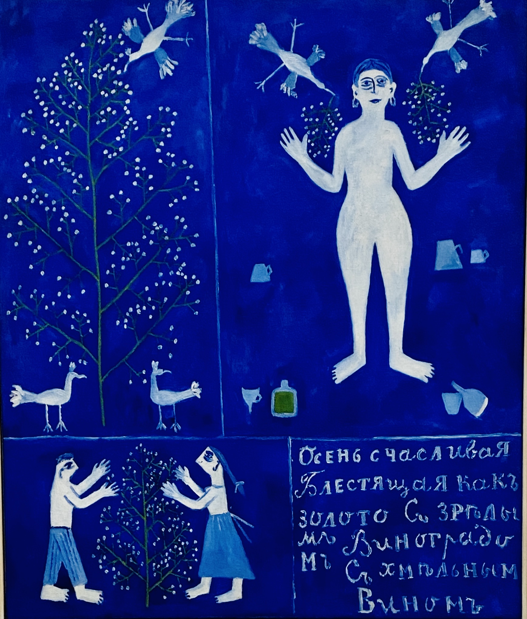
An example of a painting dominated by shades of a particular color uses distinct lines. These lines delineate the boundaries of various figures. These figures, or motifs, appear to hover and are depicted in motion, akin to a car navigating a bustling road. Through careful observation, one can interpret a multitude of elements within the artwork.
Example: Autumn (1912) by Mikhail Larionov at the Centre Pompidou: The bold use of color is striking. The use of blue, in particular, makes representational art stand out. Despite the lack of depth, the image conveys powerful movement through the birds and dynamic figures on the tree. The painterly style is evident in the sharp lines that define the figures’ boundaries.
Autumn, (1912) – Mikhail Larionov
The representational aspect, as its name suggests, focuses on the subject matter of the artwork. It involves identifying the motifs, figures, and the degree of abstraction present. This step contributes to the overall impression, which is my interpretation of what I perceive in the artwork. While this aligns with Panofsky’s iconographic level, I find the concept of “representational” more intuitive.
A house, for instance, isn’t merely a house on a blank canvas. It can be a specific house with a unique history or a symbolic motif. In such cases, questions often arise rather than definitive answers.
Or…
As depicted in the artwork below, this is not just a representation of a woman. It’s a captivating self-portrait of Frida Kahlo, painted with her own hands. Who was she? The answer lies in the rich and layered background section, which awaits discovery and interpretation in the fourth part.
The Frame (1938) – Frida Kahlo
In the “tell” section, I delve deeply into the artwork, which is my favorite part. I search for symbols, the meanings of colors, recurring motifs, and iconic traits. I want to comprehend the artwork’s layers of meaning. Every color, figure, or shape can hold cultural or personal significance. My goal is to uncover the deeper meaning hidden beneath the surface.
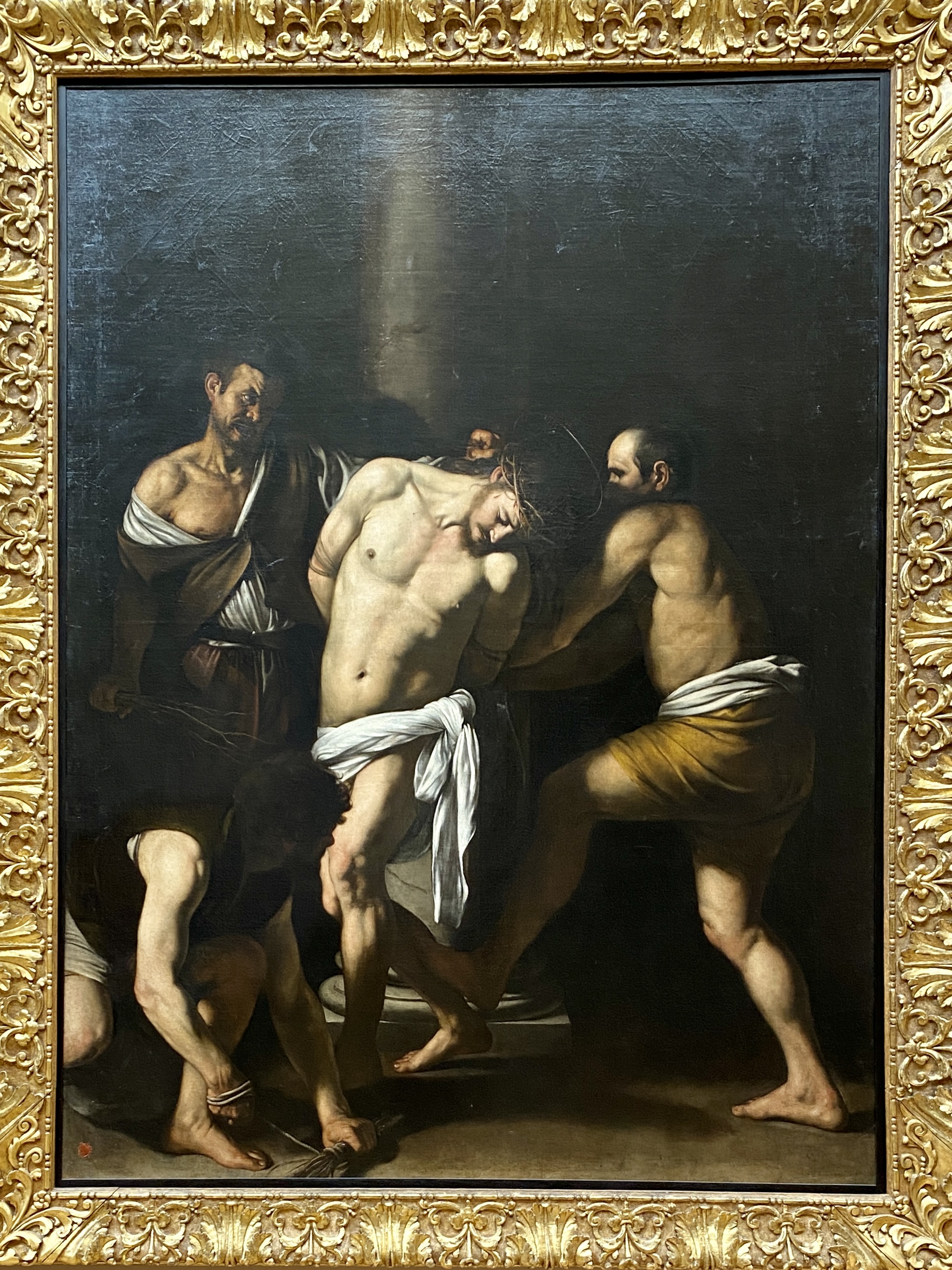
Example: The image vividly captures a significant theme that demands our attention. To fully appreciate the grandeur of Baroque art and the mastery of Caravaggio’s work, we must examine its elements. The figures in the painting are both prominent and impactful. The use of light is striking. In Caravaggio’s works, light serves a dual purpose: it illuminates the subjects and symbolizes the divine. It emanates from an unseen source beyond the boundaries of the image.
The Flagellation of Christ (1607) – Caravaggio
The meaning: the moment when Christ is bound to a pillar and scourged by three executioners. The light — the divine — falls mercilessly upon Christ’s body, almost like a spotlight. The composition is tight. The intensity is physical. All superfluous symbols or background details have been removed. The focus is entirely on the human drama.
The background section is crucial for placing the artwork in context. It delves into the creator’s identity. It explores how the artwork fits into the artist’s broader body of work. It often presents the most challenging aspect of analysis. It is also the most rewarding. This task requires a combination of knowledge and emotional insight to grasp the artist’s intentions, development, and environment.
Ragnar Josephson (1892–1966) was an influential art historian. He offers a valuable perspective on the creation of art in his book, The Birth of the Artwork (1940). Josephson identifies three interconnected aspects of an artist’s creation: psychological, social, and aesthetic. These aspects interact and influence each other throughout the artistic process. Initially, the artist expresses their thoughts and emotions psychologically. These psychological elements are then shaped and influenced by social factors. Finally, the artist emerges as an aesthetic whole, combining these influences to create a cohesive and meaningful artwork. This perspective helps me understand the artist’s intention more deeply. It sheds light on the creative process beyond the final product itself.
Imagine this: you’ve successfully completed steps 1-3 of this artwork. You possess a profound understanding of technique, materials, and knowledge. The vivid hues of blue and yellow immediately captivate your attention. The image exudes remarkable depth and employs a classic central perspective, drawing the motifs together at a focal point. You can almost sense the dynamic movement of the waves and the boats at the quay. There’s so much more to discover and appreciate.
Starry Night Over the Rhône (1888) – Vincent van Gogh
In the next step, it is unequivocally identified as a bay. This captivating evening is when the stars truly shine. This is no ordinary bay; it is a remarkable location along the Rhône River at the end of the 1800s. The view vividly captures the essence of the title, “Starry Night Over the Rhône,” for all who observe it.
The image undoubtedly holds profound meaning and purpose. The darkness effectively represents the time of day, while the bright stars clearly indicate when the scene takes place. While there are additional symbols present, their inclusion adds depth rather than overwhelming the viewer. The colors and motifs are significant elements to consider. In the concluding section, we must acknowledge the extensive documentation of the artist’s life. The biographies provide a wealth of information that enhances our understanding of the artwork.
Summary
By first observing, I establish the foundation: the technical and material elements that form the visible structure of the artwork. Through representation, I discern what is depicted and how—seeking the connection between motif and expression. In the third step, I delve into the symbolic layers that the image conveys. Lastly, the background contextualizes the artwork within the artist’s life and surroundings, situating it within a broader cultural framework.
This approach draws inspiration from Erwin Panofsky’s iconology but embraces intuition and artistic emotions. It aligns with Ragnar Josephson’s triad, which encompasses psychological, social, and aesthetic dimensions. Art emerges from the interplay between internal experiences and the external world.
Ultimately, my approach seeks to unveil the vitality of art. When observation intertwines with insight, the artwork communicates. This fosters a dialogue between the artist and viewer, bridging the gap between history and the present.
Everyday life is not just black or white. It is a color palette that captures impressions and the mind in all the colors of the rainbow. Synesthesia is a concept rather than an impression.
If I ask what your name is and you answer ”Eric”, then you are green. I am blue; Björn is a blue name, b as blue. If your name is Anna, you are red. Patrick is brown. Sofie is white. Johanna and Laura is red burgundy. Names and colors blend together. This highlights the fascinating connections I form through name and color. It’s obviously synesthesia!
If my name (Björn) is blue and sounds like an icy wind — what colors do you put on words?
Synesthesia
Synesthesia is a neurological phenomenon where senses are interconnected. Grapheme-color synesthesia, the most common form, involves automatic and consistent associations between letters or numbers and specific colors. These connections are often one-way and develop in early childhood. Synesthesia can manifest in other forms. For example, it link time units to colors. It can also connect music to visual experiences. There are about 70 types identified. While rare (0.001–4.4% of the population), it seems to run in families, suggesting a genetic basis. Experiences be projected (seen externally) or associative (internally perceived or “felt”). Wikipedia
Research
According to research from the Karolinska Institute, synesthesia is briefly defined as a unique ability. In this condition, sensory impressions or thoughts are connected in unusual ways. For example, letters may be linked to colors, or sounds may trigger shapes.
Approximately four percent of the population has some form of synesthesia, which varies among individuals and is partially hereditary. Researchers believe that synesthesia is often triggered by concepts rather than direct sensory intake. This condition may help the brain make abstract ideas more concrete. Synesthetes sometimes have improved memory and are often creative, which explains the link to artistic professions.
There are theories about connections between synesthesia and autism1. These theories also link synesthesia to obsessive-compulsive disorder2. This is due to similar patterns in brain connectivity and attention to detail. Ongoing research is exploring these connections through twin studies and brain imaging.
Synesthesia is not a disability. It is often perceived positively. It enriches individual experiences and showcases the unique ways people interpret the world. Karolinska Institutet – A medical university
How – in what way
What does the color red sound like? Only someone with synesthesia can tell. One person hears a trumpet and sees triangles, another thinks of basketball and tastes waffles. A third perceives the number nine as a unique shade of pink. Synesthesia means “simultaneous perception.” Current research suggests that often the concept or idea of something triggers the synesthetic experience. Karolinska Institutet – A medical university
My colorful everyday life
I became familiar with the term Synesthesia not too long ago. I was not aware of it from the beginning. When Synesthesia was described, it felt like my whole life was included in the expression. For years, I have seen words, numbers, dates, times, and letters in colors. It started when I was young.
A visual representation of synesthesia, showcasing months of the year and their associated colors as perceived by the author.
This is how I see the year and how it is organized in my mind. Each month has a color. The days around Christmas and up to New Year’s Eve cover the entire upper line. Christmas weekend in the first part and in between comes the intervening days and finally the new year. That is the entire upper line covers a week, unlike the lower line which covers most of the year.
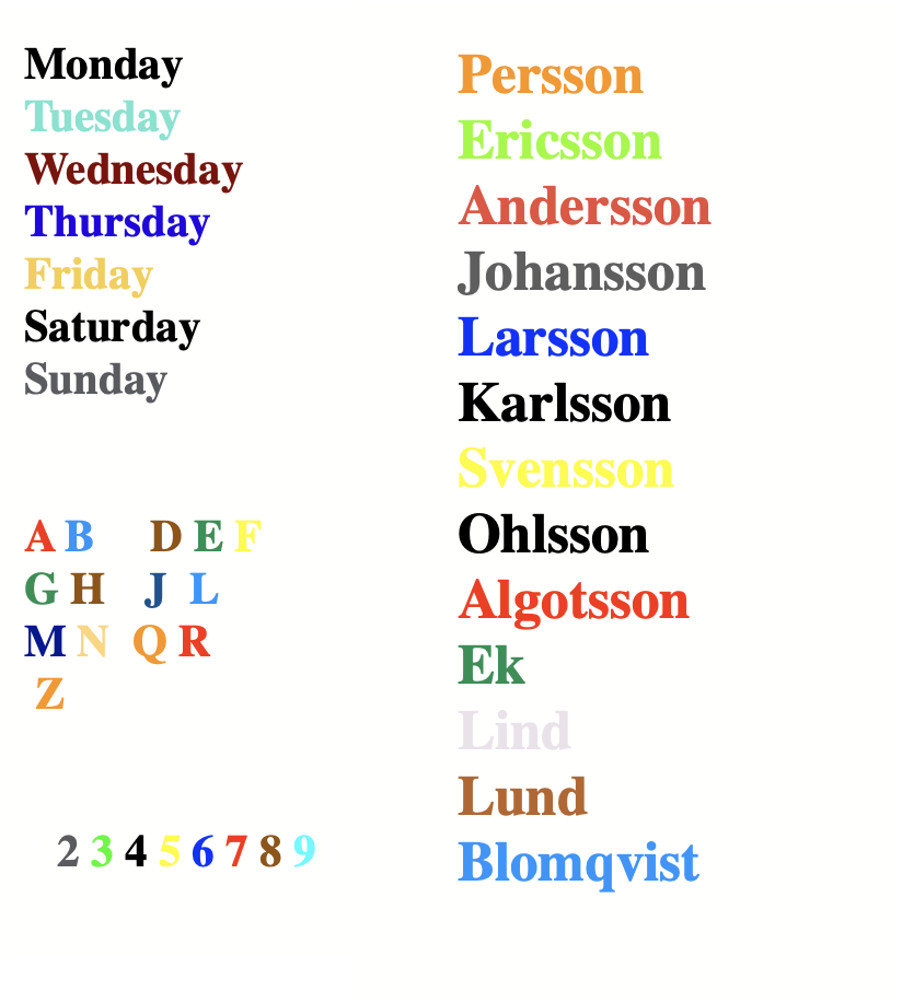
You can see how my synesthesia behaves. In the figure below, all the days of the week, a choice of names, and finally letters and numbers. What color associations do the words have with letters and numbers linked to dates, e.g., presented below.
A colorful representation of days of the week and associated names, illustrating the concept of synesthesia.
Images – repetitive moments
Every time I shave, I get the same image of a specific person from my past. Another person from my past shapes my mind as I brush my teeth. The same goes for other recurring repetitive moments in everyday life.
I have other pictures and colors at other points. When I peel garlic, images of a specific person from my past come to mind. There are many more occasions when the same images come up during the same regular task.
Numbers
Three dates stood out. Each was marked with an important to-do on my calendar. They were like milestones of creativity waiting to be explored. In the same month but on three different dates, I experienced a vision of colors in front of me. It felt as if a painter had splashed vibrant tones across an endless canvas.
The 3rd is green 🟩. The 4th is black ⬛️. It is a deep contrast that evokes mystery and depth. I have an appointment with the doctor then. The 5th is yellow 🟨. It is a bright and cheerful shade that radiates warmth and optimism. It inspires me to embrace joy in every moment. Then it’s Christmas dinner with work colleagues.
Each of these colors carries its own unique energy. They send signals to my brain to memorize upcoming events. This process acts like a visual memory bank.
They fill my days with creativity and emotion. They are intertwined with my experiences. This is a choice from my everyday life and how it can take shape in my mind. The same is true when I experience certain moments.
Conclusion
My conclusion relies on names and words connecting to the color of their first letter. E is green, as is Eric, reflecting nature and renewal, seen in last names like Ek (oak). D is brown, mirrored by names like Donovan and Duncan. Many names starting with A are red, like Andersson and Anna.
This imagery can influence my perceptions, as the first letter can signify deeper meanings. I often worry about potential “what if” scenarios. Instead of annotating appointments, I visualize them in color slots on my calendar. New colors and times can mix; 17:00 is red and 19:00 is light blue. If the colors blend, confusion arises, heightening my worries about timing and place.
Summary
Synesthesia is a condition where senses mix together, like connecting colors with names, letters, or numbers. For example, I see the name “Eric” as green and “Anna” as red. I also picture specific colors for days of the week and months.
Having synesthesia can boost creativity and memory, but it can sometimes lead to confusion when colors mix. About 4% of people experience synesthesia, which is inherited and is often linked to creativity and enhanced sensory experiences. Research looks into its ties to autism and OCD because of similar brain patterns.
In my daily life, synesthesia shapes how I see things, as everyday tasks bring up clear memories, colors, and images. For instance, certain dates remind me of green, black, or yellow, helping me to organize events in my mind.
Autism, is a developmental condition that affects social interaction, communication, and causes repetitive behaviors. Symptoms can vary greatly, and while the exact causes are unknown, both genetics and the environment contribute. Early diagnosis and treatment can help improve the lives of those with autism.↩︎
OCD (Obsessive-Compulsive Disorder) is a mental disorder characterized by intrusive thoughts (obsessions) and repetitive behaviors (compulsions) performed to reduce anxiety. Common themes include fear of contamination, a need for symmetry, or fear of harming others. Treatment often involves CBT (Cognitive Behavioral Therapy) with exposure and response prevention, sometimes combined with medication.↩︎
Kära dagbok… Nää, glöm det. Det var bara en illusion. Dagen efter det intensiva konstmötet känner jag mig lite “off”. Jag känner mig som en katt som ser en gurka och tror att det är en orm. Jag har också haft en lång repetition i att behärska ett sjungande teaterstycke. Vem visste att böcker kunde sjunga bättre än jag?
Egentligen vill jag hoppa på det igen. Ett nytt konstmöte under lunchen, såklart. Lunch är ju den enda måltid som vi alla genuint kan kalla ett konstverk! Tiden flög förbi snabbare än min lunchpromenad. Under den jagade jag både mätstickor och inspiration. Jag medger att dagens repetition i scenkonstens anda är ett konst- och kulturmöte. Det är värt att släpa med sig som en tyngre ryggsäck!
Efter hela dagen i replokalen kan jag erkänna att både hungern och tröttheten gjort en grand entrée. Tack och lov är de bara skuggor av den fantastiska helhetsupplevelsen. Är du ärligt talat, vem behöver mat när man har musik? Så kul, spännande och lärorikt har repetitionen varit. Jag nästan glömde att jag är en människa med grundläggande behov. Musikal är den saknade strängen på min lyra, så nu kör vi – låt maten vänta!
Det känns som strängen är på sin plats i en gigantisk ensemble. Ja, det är mer rätt än en katt på en solig fönsterbräda! Trivsamt i gruppen, njuter jag av varje stund, som om jag fått gratis snacks på en filmkväll.
Som amatörskådespelare i snart 18 år har jag aldrig vågat mig på musikal. Jag har mer eller mindre bara spanat in dem på scen och genom popcornslungan på film. Orsaken? En massiv tro på att jag bara kan agera och, om jag har tur, kanske snubbla mig genom någon danssteg. Sång? Snarare ett mysterium som skulle få en katts ångest på höga toner. En liten talroll är min glansroll i uppsättningen. Den är liten men ack så viktig. Jag menar, någon måste ju stå där och förvirra publiken!
På heder och samvete. Det lovas nu att nya, intressanta konst- och kulturmöten ska poppa upp här oftare än man hinner säga “bajskorv”! Egenskrivna alster och rapporter från min manusvärld ska också bli fler. Jag har hört att de har en tendens att föröka sig som kaniner!
En vecka fram i tiden sitter jag säkert här igen och bloggar. Jag har lovat mig själv att inte låta min skrivcrisis ta över. Att glömma att ha roligt under skrivprocessen är som att leta efter inspiration i en mörk grotta. Det är utan ficklampa, onödigt komplicerat och lite skrämmande!
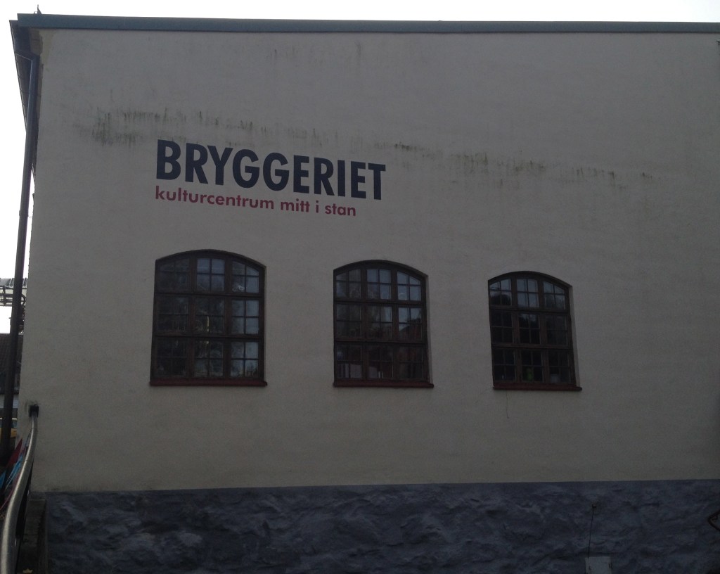
Utsikt över byggnaden vid Bryggeriet i Nyköping, nära replokaler och konstgallerier.
Vid Bryggeriet i Nyköping finns fantastiska replokaler där jag samarbetar med en otroligt begåvad ensemble. Vi repeterar med full energi och glädje till den underbara musikalen Sound of Music. Jag har en liten roll i denna magiska föreställning. Jag njuter oerhört av att få vara en del av detta kreativa äventyr!
Mittemot replokalen frodas inte bara ett, utan hela tre konstgallerier! Som konstvetare brinner jag för dessa kreativa rum. Hungrig som en björn, ivrigt vandrande bland konstverken, rörde jag mig snabbare än vanligt. Varje alster var som ett stopptecken. Inga genvägar alls, bara ren och skär fascination.
I Åsa Kvissberg (måleri och grafik) var de intensiva och uttrycksfulla linjekonturerna som fångade en i steget. Dessa linjer nästan dansade över dukarna. Alstren, fyllda av människor och händer, skapar en fängslande dynamik. Motiven kan verka abstrakta vid första anblick, men de bär på en djup föreställande kraft som väcker ens inre känslor.
Kanske inte helt hänförd av alstren, men inte helt utan betydelse. Kanske ligger inte den här konsten i min personliga smak, då jag ofta dras till historiska verk snarare än samtidskonst. Men mitt hjärta kunde inte låta bli att tolka dem i en surrealistisk kontext. Det är ett spel av vitt och svarta linjekonturer. De lyfter figurer som ansikten, poserande kroppar och händer. Dessa är strategiskt placerade för att skapa en magisk helhet.
Alstren är mestadels måleri, men det finns även några spännande verk i grafik. Detta kan verkligen väcka nyfikenhet om att förstå om det som presenteras är tillräckligt imponerande. Temat i verken är konsekvent och skapar en intressant röd tråd genom utställningen. En gemensam aspekt är den konstnärliga handlingen att låta färgen rinna, vilket ger en fascinerande dynamik till verken.
Motiv av spill och dräll med akrylen erbjuder en kreativ och lekfull känsla. Även om dessa element oftast är i blått eller grönt, ger det en härlig gemenskap och enighet i färgvalen. Kombinationen av blått, grönt, gult och de svartvita människokropparna tillför en fin variation som inbjuder till reflektion. Det blir verkligen en unik upplevelse av dessa konstverk tillsammans!
Angående detaljer och symboler, så vill jag inte ge nån direkt beskrivning. Det är som att försöka förklara varför katter tycker om att jaga snören! Magen kurrade som en besviken tiger. Det fanns i alla fall djup och kontrast i motiven. Men som sagt, de var för röriga.


![IMG_0634[1]](https://blommanskulturblogg.com/wp-content/uploads/2012/04/img_06341.jpg)
